J183 – First Thing You Do

[2/25/08] So, I was thinking J looks rather girly in today’s comic. Particularly in panel 1. Might just be my imagination.

Anyway, today’s comic and last week’s comic were originally thought up as one comic, ending in the joke that was used today. I quickly discovered that one page wasn’t nearly enough to have D notice the fridge, call J over, and execute the entire dialogue setting up for the joke; so the joke was divided into two comics. Another question was what to do for the last panel. I was pondering whether to make D and/or J say something (be it “……”, or perhaps “First class…”), but I think the silent panel conveys enough information. A lot of times unnecessary text can really dampen the humor.

At any rate, happy (early) birthday, crazy sister of mine. Enjoy your … cake?

dcomic 454

[080222]

Ho damn. I’m writing this before I’ve uploaded the comic, and I realized that we’ve finally reached the first two experimental comics. This is actually somewhat appropriate for the entry I was planning on writing anyways.

So today’s comic, or the end result of today’s comic if you get what I mean, is done completely digitally. The original comics were not meant to be solely used as linearts, they were the entire (relatively) clean lineart, shaded comics. But due to the general fluctuations of my drawing ability, the two comics which became the week’s and next week’s comics turned out to worse than the surrounding pages, and subsequently became candidates for this experiment.

Lineart is a digital trace of the original comic using a digital ink method which is a more primitive variation of my current method (as of last week’s painting). Shading is done in the method in which I was painting at the time, save with five shades of grey. It was supposed to represent some sort of pseudo-tone, but it ended up looking totally different.

Nonetheless, this is the first experimental comic for a while; I’m trying to clean up the comics, if you will. The pencil stuff is pretty clean for pencil stuff, but there are still times where my outlines and shit will come through and make things ugly. Furthermore, all the comics are done with all the hatch shading going in a single direction. Sometimes that means really awkward hatchings on spaces running parallel to the direction of hatch. Large pieces of hatch shading are also a pain in the neck to get through. Whether these are flaws in the hatch shading method itself or just my incompetence showing through is up for debate, but the point is that it dirties the comic more and I’m trying to get around these things.

By all means, these two experimental pages are pretty clean, they just aren’t totally what I’m looking for.

Now experimental comics brings me to my next point. This may be an over-generalization, but my point is that the comics usually aren’t terribly experimental. See, I thought I found what I think is another cyclical element to my whole drawing thing and that would be a sort of cycle of improvement. It occurred to me that I tend to draw in phases: sketches, comics, paintings, and maybe some downtime between all the phases; rinse and repeat. What happens is that the sketch phase I tend to experiment with modifications or improvements to whatever the hell I’m doing, then, during the comic phase, I’ll refine whatever those mods and upgrades are, and the paintings should be the cumulation of the previous two elements of the cycle.

Of course, this is largely just referring to the pure drawing aspect of the pictures. Comics see improvements in comic exclusive areas and paintings see improvements in painting exclusive areas. Or they try to, at least. And this is a general trend, stuff happens out of order, but the trend is towards what I specified.

Case in point: these are some pieces from the end of the cycle ending in June of last year (and I choose these cycles because I think its the most evident change for the past year or so):

C070612
dcomic 424
[100613: Dead link]

And from the next cycle:

Sketches:

[100613: Two dead links]

Comics:

dcomic 439
dcomic 440

Paintings:

C070703
C070928

And then some stuff from the following round; the cycle which just ended (much more subtle changes initially here):

[100613: Dead link]
[I can’t show a comic because comics drawn for this cycle aren’t up yet]
C080211

Well, most people probably can’t make out too much difference between the second two cycles. I might be biased because I see what I’m TRYING to do, rather than what actually appears on the paper. Either way, the final part of this entry is a few sketches from the cycle that’s beginning around now. What I’m doing half the time is drawing random lines on the paper and drawing figures over them. That’s a factor of some… well, interesting stuff.

[130702: Three dead links]

And yes, the big orange block in the second one is intentional. And yes, the crappy quality of the last one is due to me using my camera. If you can pick out the various figures, I think they’re pretty nice in general, though. I’m interested to see how the paintings and comics turn out this time round. And goddamn, that’s it. Another monster of an entry.

C080211

[080216]

So today’s update is a week overdue illustration, the last (theoretically) of this “set”. For those of you with a DeviantART account, blah blah blah, want to leave a comment, blah blah blah, here is the link again.

The big idea here was to try something cool with the water. For trying to do something cool with the water, it really isn’t that cool or amazing. In fact, it’s probably downright bad. I don’t really know how I came up with the circle thing, but it was after failing several times to do it any other way. You can kinda see vague traces of my trying to put reflections in the water, and of course, failing. It doesn’t actually look all that bad in the context of the piece, but it definitely doesn’t really look like water. If you ask me, at least.

The figures are pretty nice, though; at the very least I did indeed get rid of that splotchy texture there.

It actually took a helluvalotta tweaking to get the colors to my liking on this one, especially in the background. I learned that green and red make yellow and I used like an extra 50% of that, not to mention maybe half as much extra contrast. The raw painting looked like this [100613: Dead link]. I honestly haven’t found a way to get the colors right on the first go; I’ve been adjusting color levels on paintings since C061106. It’s always many times more pale than the final product. I actually speculate that this may be due to my always painting on white (they say you should never paint on white or use pure white and pure black) since the colors on the figures were painted on the original photo-scan I used which was a queer grey. And I think the colors on the figures were closer to the final colors.

It’s nice that 4.03 supports .psd; it made all that color tweaking much easier, since I didn’t have to keep converting from .wpb to .bmp to .psd which is a downright pain in the ass after a while.

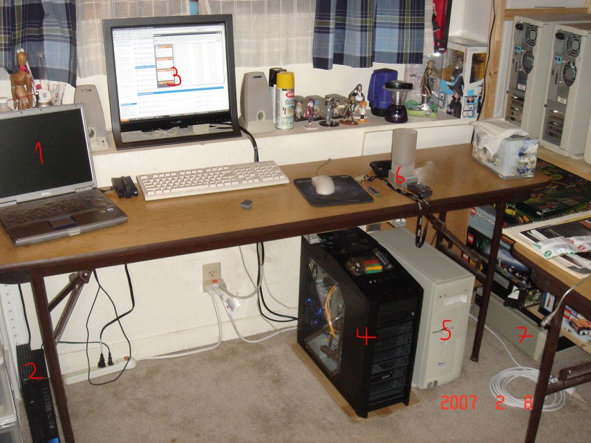
I finally got the rebate for a computer case I bought way back in November, on black friday. That’s just a little over two months. It’s both terrible and a pleasant surprise that it takes a company two months to issue these rebates; on one hand you know it probably doesn’t take they that long to process the damn thing, but on the other hand, you forget about it and one day – poof – you get “free” money. The Antec 900 retails for $140. I got it at $60. Colette is definitely not the type of system that needs a monstrous amount of cooling, so I can simply run just the largest fan at the lowest speed for great quiet and justice. I wish all cases came with a nice 20cm fan.

Here is the thing next to old of my old Dells (It’s the thing marked “4”). While the Dell doesn’t look terrible on its own, it’s definitely very beige-box-esque against the 900. I really like the angular lines on the 900; it’s exactly how I’d design a box if I were to do it myself. The tray and the top-mounted ports are also real nice for someone like me who puts their computer under the desk.

I’m typing this entry on a $14 keyboard I bought on ebay last week. Now why the crap would I pay $14 for a keyboard when I was using a $5 unit from Frys? Well, this just happens to be an authentic IBM Model M, which are, quite frankly, some of the best fucking keyboards ever made. This one is relatively recent (1995), though there are units from the late 80’s that are still compatible with modern computers. What makes these things so damn nice to type on are the buckling springs under the keys instead of the contemporary rubber crap that most modern boards use.

Now if I didn’t own an older Model F based on the same technology I would’ve said this was bullshit and that a keyboard is a keyboard is a keyboard. But I’ve played around with the model F (without outputting anything, obviously; the Model F uses an XT jack which is incompatible with the PS/2 stuff we use today and no one makes an adapter), and I’ve always thought it was real nice to use.

I’d always thought’d it’d be a waste to buy another keyboard instead of finding a way to make the Model F work, but I finally bit the bullet and said screw it. Subsequently I now have this thing in front of me and it is fucking awesome.

It’s interesting not having the Windows key between the left ctrl and alt keys. I actually use that to get ot my start menu.

This is now the oldest operating piece of computing machinery in this family, besting the Dell Optiplex in my dad’s office by a good five years. 1995 to 2008 is two eternities in the computing world.

Speaking of eternities, the oldest thing I own now is the bike I used at school. I believe it’s from the late 70s or the early 80s, whatever it is, it definitely beats my car. It’s a Peugeot something or another, made in France (I didn’t know France made ANYTHING) and it used to be my mom’s. Of course my mom doesn’t bike anymore, so there’s no reason for me not to use it. I’m definitely not the type of person to buy a new bike when there’s an antique lying around. It’s real nice cuz it’s a helluvalot lighter than the mountain bike I used in my childhood. It doesn’t have as many speeds, but who needs 18 or even the 12 gears I have; I only go through 6 of ’em on a daily basis.

EDIT: The new N-Wars hosting is nice cuz I can now use the default IE ftp client. Ok I’m done now.

J181 – Train of Thought

[2/11/08] Yep, work’s picking up. I hope I can finish this week’s problem sets on time. Anyway, yesterday we had a strange mini-blizzard out here. It started at 4:10 in the afternoon, with lightning, thunder, and ridiculous winds. 10 minutes later, it was gone; the sun came out and melted the snow (what little was actually deposited). The winds didn’t stop, though; it was gusty all day yesterday and today. So when I went to sleep yesterday, I decided to open my curtains to see what it was like outsite. This is what I saw.

That crystal-looking stuff (yellow because of the lighting) is ice.

It’s on the inside of the window.

Man, it’s cold.