d382 Photoshoops

[131210]

I’d been only thinking about it for a long time, but the day finally came when I decided to start using Photoshop, and that was that.

I’m using the “free” CS2, which may be 10 years old, but it’s still newer than both OC1.1 and PSP7 by another three. As my stance continues to be “software only gets worse”, I’m not going to go so far as to say the former is “better” yet, but it certainly has more features both of the latter combined. For the most part, the transition was relatively painless, much like the “transition” to pen – most of the graphic editing features in CS1 work the same way that they did in PSP7; they are just organized differently. I even learned about PSP features that I didn’t know existed (like layer blending modes).

The biggest change for me is switching from the OC brush engine to the PS brush engine. The OC brush engine actually has a couple sliders you can tweak, but the stock brush is pretty good at everything, so in my drive to Keep It Simple(, Stupid), I had for many years only used two brush settings: the stock one and something to do fills. I don’t think I can just use the stock brush settings in PS, but so far I’ve been able to get decent results by only changing brushes and manipulating opacity and leaving everything else alone.

So far I’ve done four paintings in CS2, and two have been pretty good and two have been pretty mediocre. Apparently I still don’t really have this painting thing down, as I can still sink a ton of time into a painting and have it turn out mediocre. Which sucks.

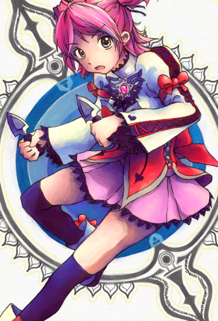
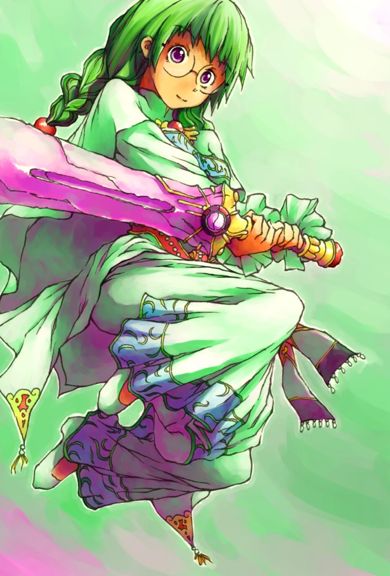
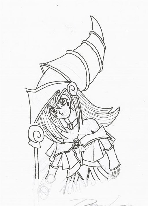
This is one of the two better ones. It’s Shinku from Rozen Maiden. The third season aired last season, and I was somewhat disappointed because while the relatively popular first two seasons were about the dolls, the producers inexplicably decided to make the third season about Jun.

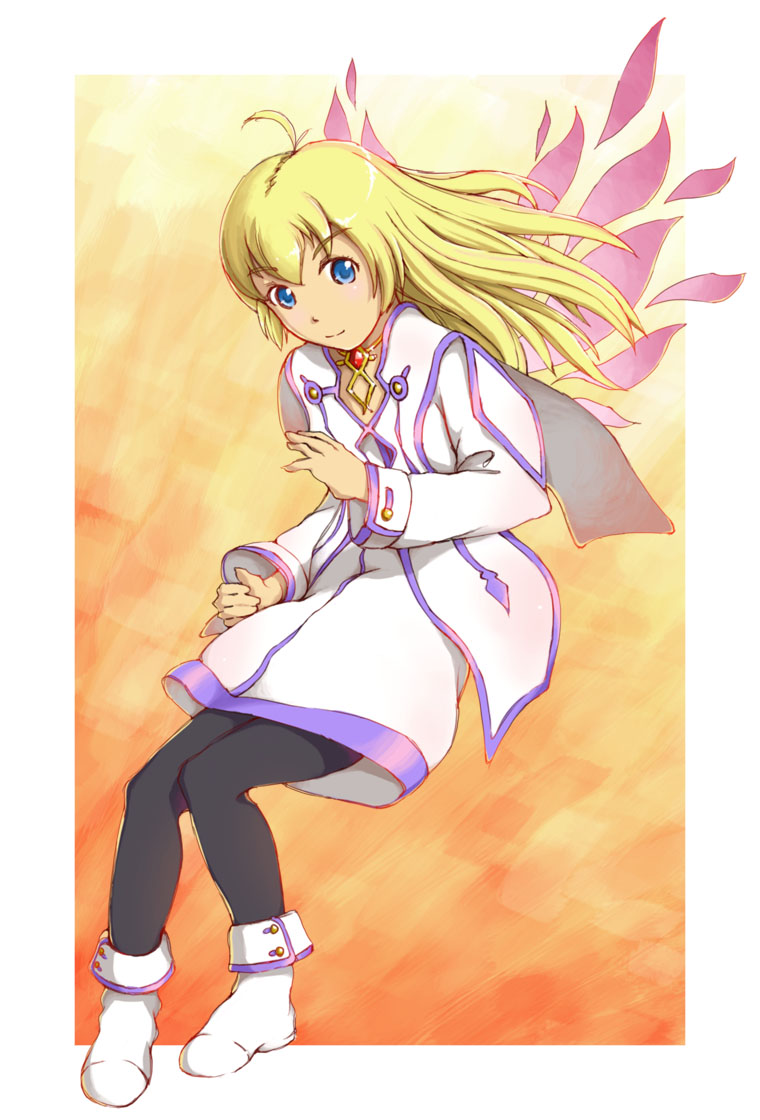
This is the other of the two better ones. It’s Colette from Tales of Symphonia. This painting is actually somewhat of a remake of the same from 2005. I think the 2005 was made in PS as well, albeit 7 instead of CS2.

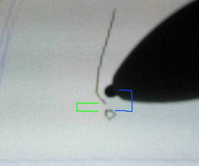
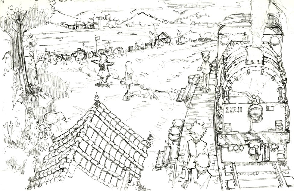
My continued efforts to find a solution to the cursor accuracy problem was a strong driver for trying a different graphics suite. PS does seem to eliminate the green delta, but the continued existence of the blue delta still makes drawing harder than I think it should be. All four of the paintings I did were digitally inked, but the linearts were still kind of rough, and I still definitely can’t comfortably draw from scratch on a tablet yet. More on this subject in a later post though!

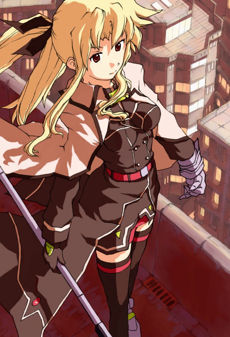
The styles of Shinku and Colette reflect what I now consider my two major “branches” of coloring, something closer to paint and something closer to cell-shade, respectively. Much like how I kit-bashed several models together to make papercraft Titanic, I kit-bashed multiple tutorials to make these paintings. I really like Shinku’s background, which was done in PS from scratch, but I think Colette’s figure turned out better. Colette also has some places where I tried to color the lineart, which is something I’ve wanted to try for a while, but is apparently more difficult to do well than I had imagined.

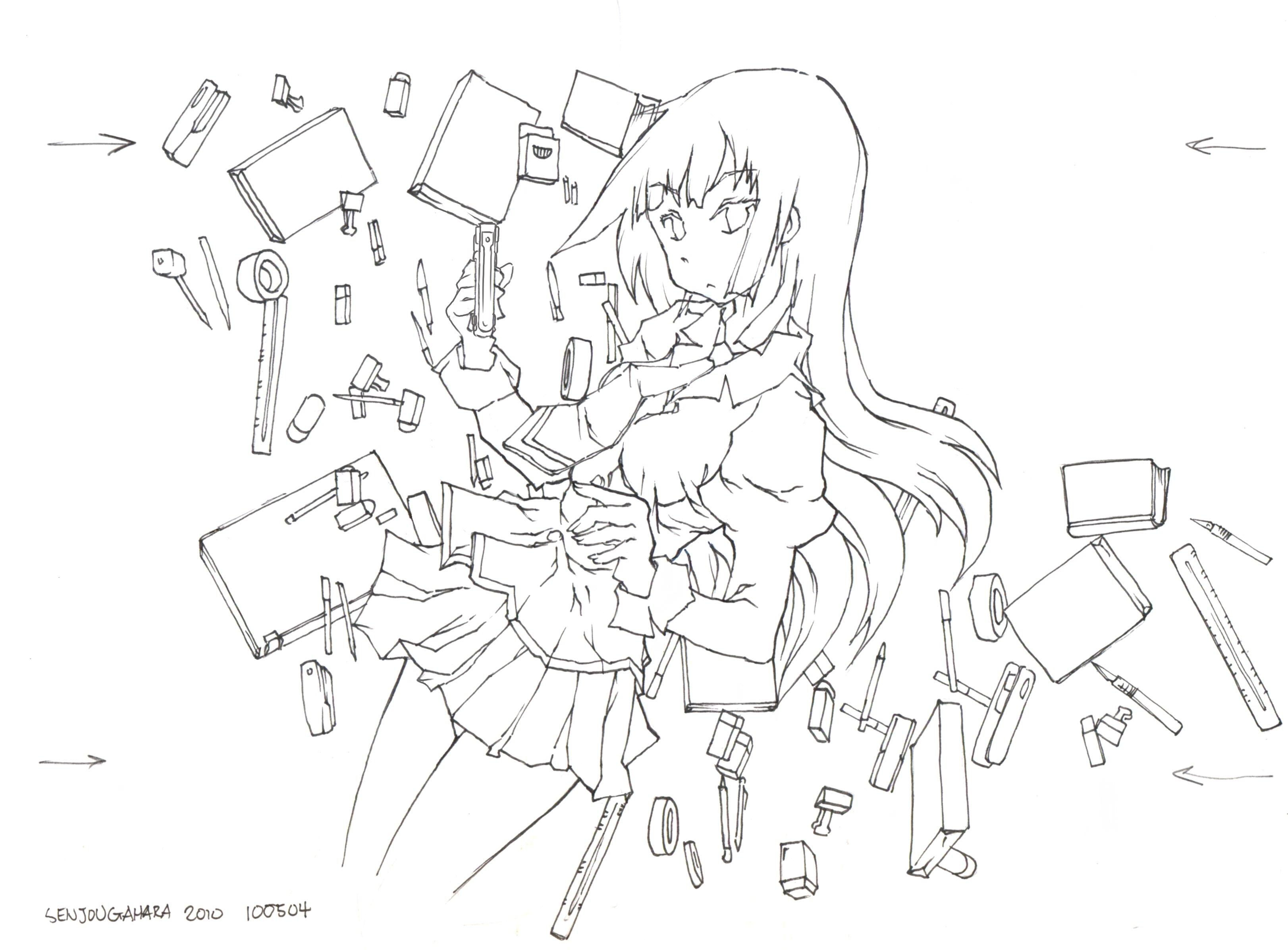
If there’s anything I’ve learned (or relearned) in this process, it’s that everything still comes down to having a fantastic lineart, in which case the coloring doesn’t need to be spectacular. As such I’m going back to just drawing for a bit after this.

d378 Chikara 2013

[130707]

This painting was actually done back in July. It has a couple “first in a while” elements: the first Chikara painting since 2007, the first digital lineart since 2010, and the first cell-shade painting since, well, last year. Also of note is a from scratch, no lineart background that isn’t just a tree. Or a shadow. Or a rectangle.

Continue reading “d378 Chikara 2013”

d362 Aria Trio 2012 R2

[130103]

Well this post is labelled for 2012 because the painting was supposed to be done last year. It’s labelled “R2” because of this rubbish painting from June.

Back in January I told J something like “I’m going to make three paintings that I actually like this year”. Had this actually been completed last year, it would have been the 13th out of 18. In 2011, it was basically 0 out of 5. In fact the total painting count for 2012 (and this is not counting “full” experimental and “sketch” paintings) was just 3 shy of my all-time high of 20 in 2006, which still surprises me considering the long-term trend.

Despite this achievement the biggest deal in drawing for 2012 was actually finally switching to pen. For a while I was thinking that it would never happen, especially given the numerous false starts I mentioned in d356. That being said, it’s been a couple months now, and I think I can safely say this isn’t a false start. For sure ink has solved more problems than it introduced, and some parts of this painting are definitely a product of the switch.

So let me list some of the “features”, which are new to this year:

    All-ink lineart with HB backdraw. I’ve actually been surprised at how much better line quality turns out when I’m not tracing the final ink layer. Everything from the Cheria to the Misuzu was a pen “finish” of a conventional HB lineart, and I just feel that the final lines are less refined than those in Graces R2 and this painting. Maybe it’s just me.

    Slightly hybrid “gritty” background. The “slightly hybrid” part refers to the fact that it’s not entirely detailed in pen. A couple small sections are paint-only, as seen in the raw lineart. “gritty” is J’s term, but to me it refers to not trying to be exact about the drawing and just going for the suggestion. It’s like the whole implicit/explicit thing I keep ranting about for painting.

    Pen-tool based paint process. I talked about this in d358, and I even had those test paintings, but this is the first time I’m implementing it at scale in a traditional painting (as opposed to a from-reference a la last update). These are not strictly done with the pen tool by any stretch of the imagination, but using it really helps with precision in form and in color.

While I think the figures are actually pretty good, I’m still more happy with the background in this. It’s the first nice, non-abstract painting background that I’ve had for a really long time. Both the pen lineart and pen painting contributed immensely. I think I’m also starting to get a grip on painted clouds, but we’ll see with a few more samples. Copying stuff – or even modifying from reference – really helps in everything as well.

Overall I guess there is still a ton of volatility in painting quality. The rubbish June painting came right after the quite decent Philia painting; it was done basically the same way, so I don’t really understand why I think it’s that bad. I was trying to investigate a little by using the same characters and palette here, but I’m not really sure it helped.

d359 121116 Ink Drawings III

[121110]

Another month, another update. One of these months we might get two, since the mean time between updates is more like 20-25 days. This update features some history and some semi-experimental ink drawings done over the past couple weeks where most of the focus is on backgrounding.

Early last year, I started to make a conscious effort to work on backgrounds and the balance between foreground and background. As such, there were some okay drawings and some slightly less okay drawings. These were all done with the same process that I had been using since the end of the NW Directorate story, and I think even back then I realized that I was pushing up against some of the process’s limits that would eventually be “solved” by pen.

But pen was still more than a year away at that point, so in the meantime there were some experiments including an unconventional series of draw-by-references, and a splash of what I’m now calling “gritty” drawings before I went on my painting rampage earlier this year. Only toward the end of said painting rampage did background/foreground balance come back to mind, cumulating in my scratch-painted background for ToG 2012 R2.

I think traditional line-and-fill figure on painted background is ultimately the way to go, so I recently thought that I should try to implement the same thing in pen.

The figures are drawn the way I always draw figures, but I’ve been testing this multi-directional hatching, which tries not to obscure actual lineart “underneath” it. It does a decent job of that, but it also makes everything look textured, or moreso than mono-directional hatching. I’m also trying to distinguish between “hard” and “soft” divides by outlining or not outlining the shadows. The background is an evolution of what I just called “gritty” (J’s term, btw), but it’s basically my pen equivalent of a painted background. This picture is actually the first time all these things are coming together, and I think it turned out pretty well.

This is actually a redraw of a drawing from spring.

Moving along, a drawing in all HB. I’ve been trying to sketch in pure HB and basically eliminate a specialty tool from my processes (lighter pencils). Here I guess I just wanted to try shading a lot of stuff.

Tried some landscaping and water and stuff like that. This was actually okay until I tried to put in the cloud effect in the background, which didn’t go over well. It’s supposed to be sunlight above a thick layer of clouds.

Finally, a drawing from one of J’s prompts. I was trying to draw a better sense of space, but the cloud effect (which I just had to try again) screwed it up again. I’ll make it work someday.

d356 120727 Ink Drawings

In the future, I might look at the content in this post as a turning point. Then again, I might not.

Previously, my relationship with ink has been a downhill journey at best. When I first started doodling in preschool or elementary school, I used all sorts of permanent drawing tools including pens and markers and crayons and whatnot. Back then I don’t think my drawing sense had any concept of “rightness”, so I don’t think there was ever anything “wrong”, and as such, there was never any need to erase. As late as the first adventures of BKS this still appeared to be the case.

That being said, that first comic was probably one of the last of its kind, and ink doesn’t show up again until 2002, when I did a series of pen and colored pencil “paintings”. The pen was, of course, only used to trace the original lineart such that the colored pencil didn’t smear anything. A little later, I made an attempt to implement ink in my normal drawing process, but that clearly didn’t pan out.

It was only much, much later in 2010, that I finally turned out some decent drawings in pen, albeit for a class. I even attempted to ink a figure in pen, but ultimately, I went back to pencil for another two years. Ink came back in 2012, but it was, yet again, a matter of tracing completed pencil… until now.

This chapter actually starts in June, when I asked J for a topic to draw. He suggested “neoclassical”, and I sat on it for a while. I had something in mind, and I made a thumbnail or two, but for whatever reason, I didn’t get started in earnest until just a few days ago. For whatever reason, and I’m not really sure if this was premeditated, I started in pencil and decided to throw some pen in there, not as a trace, but as the original lines. Ultimately what resulted from J’s suggestion is this monstrosity:

And that is what I believe to be the turning point.

Continue reading “d356 120727 Ink Drawings”