C091219

[091229]

So J decided that we should do a little NW activity, and I obliged. He said we should each select a “best panel of 2009”, and I did. So now I’m going to comment a little on my choice.

The panel in question is the last panel of “Manly Thirst” in j???. Runner up is the last panel of “20 More Questions” in j???.

For the most part, while I don’t really abide by this rule, I think content is the more important thing for a webcomic (over art). The only webcomic I read these days is XKCD, because, well, it’s clever.

So for me, since I don’t really do anything notable content wise, the choice would default to “which panel has the best art”, which is indeed how I’d select a best panel for myself. And I think I’ve written about this before; the best panel is probably something in 520 range or whatever.

For J on the other hand; he’s actually got some clever ones, so I find myself skipping over most of the story strips and debating between the clever ones, and there aren’t too many of ’em. Most of them like “RLRAOS: New Jersey” in j??? are funny wholistically, but you can’t really say that there’s one panel that really works well on it’s own. Same goes for something like “Playback” in j???.

So it comes down to the two aforementioned choices simply because I think they do well standing alone. The last panel in “20 More Questions”, I’d giggle if that was a standalone comic just because of the word “poop”. Yeah, yeah, we’re all a little immature. That one does better alone text wise, but the kicking ass thing has the funny dude and J w/h uniform, and that ultimately swayed me over to “Manly Thirst”.

Ok, enough of that, here’s today’s update; the last painting in this batch.

Continue reading “C091219”

J265 – Eventually, You Learn to Shuffle

[12/28/2009] So, the last update of 2009!

I’d like to take a moment here to reflect on the divisions between decades. Consider, the years 1980-1989 are considered “the 80s”, 1990-1999 the “90s”, etc. Ergo, on the 1st of the next year, we will enter the “2010s”. All well and good; this makes sense.

However, think back to the year 2000 (yes, it’s actually almost 10 years ago now. Scary.). When January 1st, 2000 came along, people celebrated like crazy for the “new millenium”; I remember hearing about a cruise ship that crossed the International Date Line so that passengers could celebrate twice. However, apparently according to technical defintions, the new millenium actually began in 2001! Consider, if you count 1000 years, you’d start from 1001; starting from the year 1000 would imply that the previous millenium (0-999 AD) was counted starting from 0, which would be … irregular.

But if you follow that definition, the decade of the “80s” runs from … 1981 to 1990, which makes even LESS sense.

I hereby propose that whatever technical convention is there be tossed out of the window in favor of fewer headaches. I hope you’ll all celebrate the start of the “2010s”; I’ll do it by waking up, drinking a cup of sparkling apple cider, and going back to sleep less than half an hour later.

Okay, time for some apple caramel cheesecake. See you all next year!

C091215

[091223]

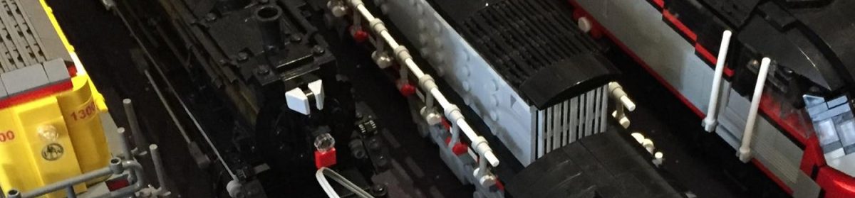
This week’s update is the second of three paintings (confirmed now) going around this time around. Quite frankly, this one’s the worst of the three, and it doesn’t really compel me to talk about it. Two and three were originally separate, then I decided to combine them, and then they became separate again, because this component turned out poorly.

The lineart isn’t actually all that bad; I think between the three paintings going up this cycle, all of them are pretty good – and they’re consistently pretty good, which doesn’t happen too often. Between the last three paintings before this cycle, two are what I’d call “shoddier”… and even between the three before that, I’d say there are two that’re worse than the third.

Color wise, while I was actually doing the coloring, I was thinking that I’d finally gone overboard with all the extra red that I like to drop into these paintings, but the post processing really reduced the… uh… I dunno what the proper word is; the jarringness of the extra colors or something, though.

Anyway, this entry was originally going to be about resolution, but I don’t feel like writing said entry, so I’ll save it for next week.

I’ve been playing two kinda old games recently… one is RollerCoaster Tycoon, and the other one is Starcraft. I’d like to take an entry to reflect a little abit on these. RCT is a little more interesting to talk about because I like the game, and I actually have saved games from when I first beat the game and expansions back in the late 90s and early 2000s. I really wish I could find some old replays, but the SC era (7th and 8th grade) seems to pre-date my archives, and there’s just nothing left.

With RCT I actually think I’ve beaten the game and expansions three times by now (or rather, me and my brother are on the third time). This is a little bit amazing given that there are about 25 + 30 + 30 maps to play, and each map takes maybe 2-3 hours on average. If those figures are right, that’s about 600 hours just doing the scenarios – which doesn’t actually seem that long when framed this way…

Anyway, the first time I went through the maps, I adhered by the very arbitrary policy of building each ride I could get exactly one time, and charging exactly one dollar for each ride or something inane like that. Each like rollercoaster was built the exact same way with like a single lift hill and slope, and that was it. This was actually quite a handicap at the time cuz you really don’t make any money this way, and the ratings on such built roller coasters are really abysmal. In retrospect, I’m a little surprised that I was able to beat all the stages this way.

Oh, and they were all Pokemon themed. The first time I went through RCT, it was on the old Pentium II Dell towers we got in 98/99 way back when Pokemon was the thing.

Second time through musta been before 2004, as I’m pretty sure I was still using Windows 98 and the CpT C. I think the release of the second RCT expansion prompted my going through the game again – this time around the rides were fairly well built, but some maps were still pretty hard to beat, and I still followed a policy of building one of every ride and pricing everything fairly low. I also always built some sort of transport ride all around the park as the very first ride. I think that was an even bigger handicap simply because it sapped so much of my money when I needed it the most – at the start of the game.

This current time around – some maps in 2008, some maps right now in 2009 – the game has deteriorated to becoming less of meeting the map objective, but more of dicking around and meeting the objective along the way. I don’t think there was any map that was particularly difficult, which suggests just how easy this game is if you know how to manipulate it.

This sequence of pictures shows a map in the first expansion played three times – the first in 2000 or so, the second in the 2004 cycle, and the third, just a couple days ago. You can see what I’m talking about with all the rides being the same, better roller coasters… and then dicking around. In that last one I was actually trying to build one ride with the highest possible instantaneous ride income. The previous two records were like 44k and 20k; well this is now 60k, and there was a lot of silliness going about trying to get there.

Alright, what can I say about Starcraft. I dunno… it’s hard to draw comparisons when there’s nothing to compare with.

I used to have a fairly good Terran build order that’d get me 12 battlecruisers and wall off my base in like 10 minutes. If you put missile turrets in front of bunkers, the AI enemy tries to attack the bunkers, but the missle turrets block them, and they kinda don’t know what to do and fail. I think it worked something along those lines. After that, 12 battlecruisers can pretty much take out any AI base…

Probably even faster for 3v3s and shit, as I don’t need to build that silly defense.

I played Protoss for the first time… probably since 7th or 8th grade. I used to think all the races needed totally different mindsets to play, but at least against the AI, i feel like you pretty much just get by messing around however you want. I used to make these really rigidly planned out terran bases, but my protoss bases just kind of sprawl out all over the place.

ok, that’s probably enough for now. TIL NEXT WEEK!

J264 – Not So Common

[12/22/2009] Aaaaaand one day late again as usual. But we’re back to normal comics! Yay!

Of course, luck would have it that I would run out of comicking templates when I came home, and be unable to find the file again. It seems to have turned out okay though.

Anyhow, enjoying my break~ The funny thing is that it feels colder here than at MIT, because the heating systems aren’t so ridiculously overpowered. I actually get to wear socks while indoors!

Happy Hannukah/Christmas/Boxing Day/Kwanzaa to all of you out there, by the way, however many of you there are.

C091212

[091222]

This week’s update is the painting that I mentioned last week, and the first of two – maybe three – for this “cycle”.

It’s actually been a whopping eight months since I last did a painting, so I figured I damn better do one or something. Ever since I started doing paintings, I’ve never had such a long hiatus between two of ’em. Especially through 2006 and 2007, I was pretty much turning something out every other month, but things started to taper off in 2008, and a helluvalot in 2009. Even if I do three paintings in the current cycle, that’ll make a grand total of five paintings for 2009, compared to 8 for 2008, and 11 for 2007.

Anyway, I was messing with a couple of things this time around, and I thought I was going to end up with something significantly different from any previous work, but… it wasn’t. Well, ok, it’s more like I still feel that this picture gives off a different “feel” than any previous picture, but I don’t really feel like anything drastic happened at a lower level.

So here it is, Raine and Tear 2009 versions. This is more like the “benchmark” illustration for the year, as I don’t have a DMG 2009 version, nor do I plan to do one as one of the three.

The last Raine illustration was February of 08 and the last Tear illustration was November of 07. You can kind of see what I mean when I say that the painting style really hasn’t changed much. I’ve been doing the same patchy kind of thing since 071120, and I think I’ve mentioned that it gets pretty bad in 080126 before I struck a balance somewhere.

Lineart quality (and I emphasize this word to make a point later) is actually most similar to 081015 in that I only use a 1pt pen to do everything and go over lines a lot, rather than the fairly neat 2pt deal used in Raine 2008. At the working resolution of about 3400 by 2500 (iirc), this is actually fairly messy, but at the standard posting resolution of 760 x 1112 you really just see a single line. More on that later.

So if quality of the painting and the quality of the lineart – in the sense of “properties”, rather than “good or bad” – are more or less stuff we’ve seen before, I’d love to say that it’s lineart content (as in the actual drawing itself) or coloring content (not sure what this would refer to… the colors themselves maybe?) that has improved, but that might be a little optimstic. I did spend a lot of time tweaking this lineart after the initial scan, so I won’t totally discount it though. I still strongly believe that I solid lineart hella makes up for shitty paintjob.

With fanarts like this (the majority of my painting these days – hey, it’s fanart that sells at like Fanime), most of the colors are actually taken straight from the reference drawings. If the reference drawings don’t give me enough range between the light and the dark, I will tweak the colors a bit, but I think they’re fairly faithful for the most part.

I did add extra red to the picture though (at the painting stage – I always increase red a little bit during the color adjustment stage), and I think it really helps add some – in J’s words – “visual interest”. The lighting kinda got ambiguous towards the end cuz I wasn’t paying too much attention, but these days I really think that I good paintjob has less to do with how it’s done than with the colors themselves and how they interact with each other. The previous three “best piece”s 090129, 080702, and 080126 all have a set of secondary (and more in the case of 090129) colors mixed into the base colors, and they were all “best” paintings despite fairly different painting and lineart styles. So color I feel is a big deal.

So where is this going – I guess the suggestion here – and I actually didn’t think so far ahead at the beginning of this entry, so this is new material for me too – is that color and lineart content, that is, the colors and the drawing themselves, are more important than how they’re put onto the paper or whatever medium you’re working with. It doesn’t matter if you have a nice, clean lineart if the drawing itself isn’t that good. I guess the same goes for color, but it’s kind of hard for me to give examples as I can’t quite draw the lines between good color, bad color, good coloring, and bad coloring.

And this is where I’m going to segue into one of the main pillars of my current theory of “good drawing”, but I think I will save that for next week as this week’s entry is getting long. The point that I wanted to make was that this’ll surpass Mikoto as “best picture”, but I’m not 100% sure what I think I’m doing right.

Ok, that’s it for now.