
[091229]
So J decided that we should do a little NW activity, and I obliged. He said we should each select a “best panel of 2009”, and I did. So now I’m going to comment a little on my choice.
The panel in question is the last panel of “Manly Thirst” in j???. Runner up is the last panel of “20 More Questions” in j???.
For the most part, while I don’t really abide by this rule, I think content is the more important thing for a webcomic (over art). The only webcomic I read these days is XKCD, because, well, it’s clever.
So for me, since I don’t really do anything notable content wise, the choice would default to “which panel has the best art”, which is indeed how I’d select a best panel for myself. And I think I’ve written about this before; the best panel is probably something in 520 range or whatever.
For J on the other hand; he’s actually got some clever ones, so I find myself skipping over most of the story strips and debating between the clever ones, and there aren’t too many of ’em. Most of them like “RLRAOS: New Jersey” in j??? are funny wholistically, but you can’t really say that there’s one panel that really works well on it’s own. Same goes for something like “Playback” in j???.
So it comes down to the two aforementioned choices simply because I think they do well standing alone. The last panel in “20 More Questions”, I’d giggle if that was a standalone comic just because of the word “poop”. Yeah, yeah, we’re all a little immature. That one does better alone text wise, but the kicking ass thing has the funny dude and J w/h uniform, and that ultimately swayed me over to “Manly Thirst”.
Ok, enough of that, here’s today’s update; the last painting in this batch.

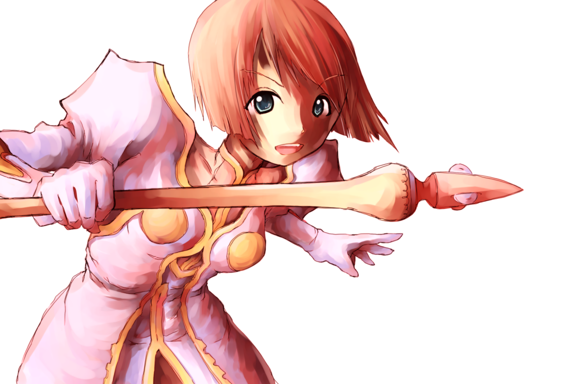
Between Philia 2009 (this one), Estelle 2009 (C091215), and Tear & Raine 2009 (C091212), I think this one is the best one. If I had been arsed to do a background, this one mighta succeeded Tear & Raine as “best painting” in just two weeks. Usually if the first painting of a batch is really good, the rest all turn out to be… well, shittier; I think it’s really, really rare that I have a followup that actually matches the quality of the first in such a batch.
Looking back at all my paintings, I’d venture that it’s actually never happened before.
Anyway, pretty good lineart, pretty good colors, still a couple places that could use work, but Raine & Tear 2009 also has places that could use a bit of work. So yeah, I’m happy with this one (which is also pretty rare, imo).
Ok, so this is probably going to be an insanely long entry. I’m going to comment on this painting and the general drawing “theory”, and then finally get around to what I said I was going to do in d219, which is taking a look at some of the “milestone” pictures/comics from these past 10 years (because it’s the last update of the “decade” obv).
My general sentiment here at the end of 2009 is that drawing is pretty much a trick. I remember talking to J about this once, and he was saying something like “ya, it’s gonna be an illusion because you’re trying immitate 3d on a 2d surface”, etc, etc. Yeah, that’s part of it, but I wanna suggest it’s more like – take this painting for example – when you look at it wholistically, you don’t really look at the individual brush strokes even though they’re fairly distinct (ie poorly blended or not at all). Something like that.
It’s like the hatch-shading I do for the comics now; it’s very obviously just a bunch of short, horizontal lines, but if you look at the comics “naturally”, you’ll see shades and shit instead of those horizontal lines. The same goes for my lineart itself these days. I’m always telling J to make his sketches cleaner, but in the grand scheme of things, mine aren’t totally smooth either – especially in clothing I tend to make a lot of maybe useless squiggles, but ultimately, because you look at a picture as a whole, rather than inspect each line individually, it doesn’t matter that much.
I think my most recent batch of sketches are a fairly good case in point.
Just like with what I said about colors over execution in painting, I want to suggest at this point that with lineart, the overall figure is more important than the details. I mean if you look at Ken Akamatsu’s characters, they’re ultimately pretty simple relative to, say, the guy who does Trigun’s characters, but I think Akamatsu manages his overall figures better, but either way, I don’t really think you’d notice that Akamatsu’s characters are less detailed because you just don’t really pay attention to those sorts of things when you’re just flipping through manga. At least I haven’t really thought about ’til just now.
So you get to a point where u can manage the figure such that it’s not weird or anything… and it doesn’t really matter how you “fill it out”. Same thing with the painting stuff. This really is total reversal for me in the grand scheme of things – back in elementary school I was always working on like greebling drawings rather than the wholistic approach I’m advocating here.
So let’s start with some old drawings here from the beginning of the decade and work towards the present.
01.03.02: I’ve posted this before. In and of itself, comic 144 isn’t terribly significant, but as I mentioned in Episode d249, it’s a good representation of all the comics done between 2000 and 2003. The art during this period is so similar, if I had to choose one strip for significance, it’d be comic 92, the first comic with a date. I’m very glad, even now, that I started dating stuff at this point, even if many pictures from this period still just say “2002”, or “2003”.

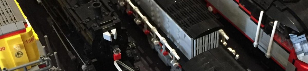
02.00.00: I’m trying to keep some of these newly uploaded pictures small in order to conserve bandwidth. Back in the day here, the comics were really of secondary importance to what I considered my core competency – machines. This is a picture of a Slick Wheels class locomotive (thank you J for the brilliant name), once again not terribly significant in and of itself, but representative of several years of work. I chose this particular image as you’re going to see the Slick Wheels pop up a couple more times here… I think.

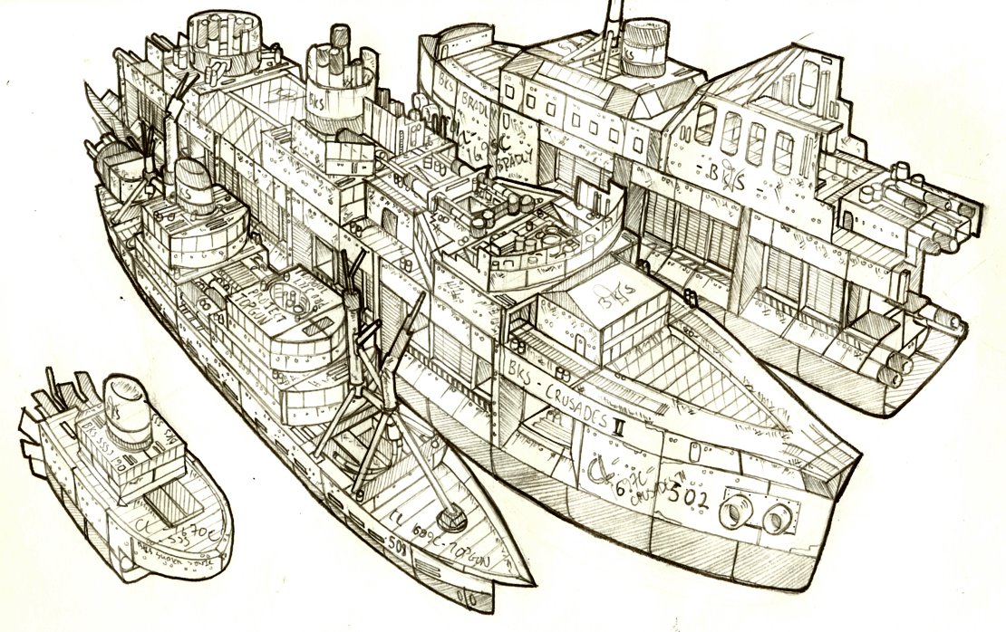
02.00.00: Another one without a definite date other than the year. This one’s a little significant as it is from this illustration that the design of all BKS/CL super-heavy battleships ultimately derive. This is what ultimately becomes an Enigma class ship; I will show a more recent rendering in a bit. Other than being my first foray into “conventional” spacecraft (like not ones that look like trains or ships), this illustrates a point I mentioned earlier in the entry: the focuz on my drawing at this time was mainly on the greebles on this ship; the overall form is kind of distorted and it’s very noticeable.

02.00.00: This is really the drawing that started it all. A full year before J finally kicked me to start drawing free-hand, non-shitty (or rather less shitty) figures, I did a series of (copied) DMG pictures (and an IFL and Rena from .hack//twilight) in pen and colored pencil. It’s kind of cheating because it’s copied, but these are really my first figure-centric pictures and subsequently I think they’re important.

03.00.00: Colored. Battleship. Colored anything was really rare back in the day; even now colored machines are still rare. No real comment on this one – representative of a few primitive pen and colored pencil colored pictures I did during the period (including the DMG/IFL series).

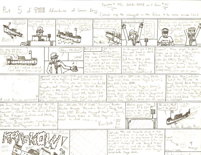
03.04.00: I’ve written about comic 193 in the past, as well as comic 192, which directly precedes it, so there’s not too much to say here. 193 is the first “new-style” comic (really, quite old style by now); thank you J for pulling me away from whatever I was doing previously.

03.00.00: Looking at the Engima from the previous year, this is really a marked improvement. I’m not quite sure how I did that; the dates might be wrong or something. This is really the beginning of the end for machine-centric drawings as they’ve been for the first half of my life. There’s a series done in a similar style over the course of a few months, but by the end of 2003, my focus shifts to Starcrossed, and suddenly the comic is the main point. You can also start seeing a little more care put into the “wholistic approach”. No definite date, but I’m pretty sure this came after 193.

03.08.01: This one’s interesting in part because it’s never been posted before. This is comic 200, and it lays the foundations for the slow Akamatsu-ist stylistic development that takes place over the next few years. With 193 through 200, the characters are all styled differently from each other – in the last panel, the dude has Yugioh eyes – 200 is the start of a unified character styling. It’s also significant just because it’s comic 200. Lazy photo-scan for the lose.

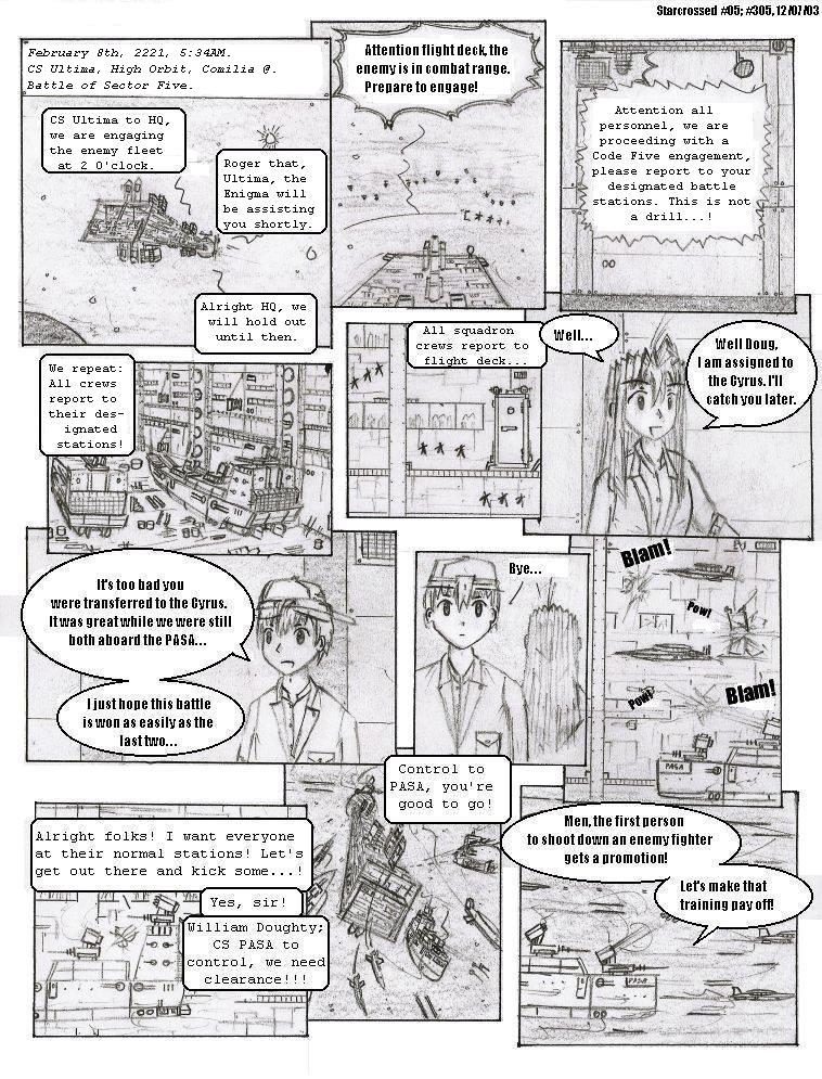
04.06.12: I’ve posted the first page of Starcrossed before, and it’s not really all that significant besides the fact that it’s the first page of Starcrossed. You can see the merging of my character and machine styles. Or something. But what’s a little more interesting is a page from near the end of SC, in this case page 51. Really this just goes to show how volatile the styling still was at this point – it goes from super-smudgy to fairly-clean-w/h-ridiculously-pointy-chins in about six months. Another representative picture.
Also, Enigma class in the third panel.

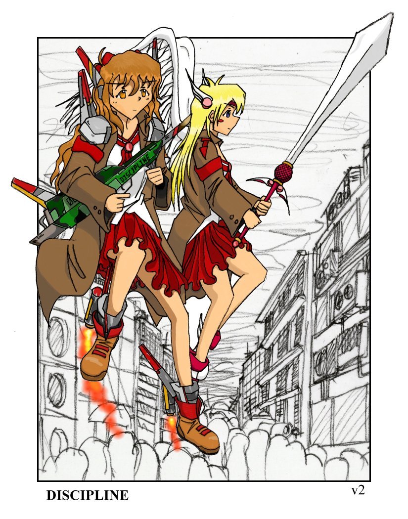
04.07.00: The first digitally colored picture! It’s the SC cover page. No definite date, but it’s very certainly done after the last page of Starcrossed in July. This is first digital coloring, but the process is a one-off (“Discipline” of later in the year is the first thing to share process similarities with subsequent paintings) done in – of all things – Photoshop 7 under Windows 98. I was doing this (by hand by the way – no tablet for another year!) on my CpT C, and I simply can’t believe that I had the patience to get this done on a 400MHz PII Celeron and 128MB of ram. I don’t even want to do post-processing on my HP these days cuz it’s so slow…

04.08.30: The first NW strip! This is significant because it is significant. Circular reason works because circular reasoning works. Technically this is the second strip; there is actually a test comic put up while the site was under development that’s labeled “dcomic001”. The test comic can also be considered the DMG benchmark for 2004, illustrating the pointy chins and a fairly sketchy sketch style for the period.

04.12.20: First foray into pen! This is one thing J’s gotten down pat that I’ve never managed to grasp…

04.00.00: There’s a lot of stuff done in 2004. This is labeled as my DMG benchmark for 2004, but I can’t believe it was done in 2004. There are so many shittier paintings labeled for 2005 (in my archives)… this was really ahead of its time. Good lineart for the time, decent colors; this is the high-point of this horrendous painting style done with the “smudge” tool in Paint Shop Pro 7. Also the high-point of pictures done with tracing paper!
Also, the traction engine gets a nod for being the only digitally-colored machine-centric painting I’ve ever done.
EDIT: So I’m 100% sure this is from 2004 now, because I talk about this painting in episode22, dated for 04.11.11. Some of these entries which I had previously believed to be quite lengthy (04.11.11 included) really seem to be quite brief… Furthermore, the traction engine actually seems to have been done in 2004 as well, as I talk about THAT in episode24. Double fail.

05.01.11: I’ve singled out this picture before, and I will single it out again. This is, again, ahead of its time. There’s just six months separating this DMG 2005 and the Starcrossed cover and what a six months that’s been. I don’t draw or shade like this for very long, but the few pictures I did during this period are really pretty good for the time. I don’t think I’ve ever attempted to do another “finished” pencil drawing in the same way as this.

05.03.13: Styling still changing very rapidly at this point, just two months later, and the paradigm is totally different. This is the “Clamp Season” drawing (thank you again J, for the label) that represents a period of hard, straight lines, and almost colored solid shading. I was looking at the sketch book from which this picture came, and I can’t believe I had the time to do these. The lineart and shading quality (not content, though) is all pretty good for an extended period and must have taken forever…

05.04.xx: This one surprised me when I came across it. Never been posted before. I’d totally forgotten about it, but it’s actually my first painting done in OpenCanvas. Nothing else notable about it, though. The colors are pretty shitty and the lineart isn’t great for the time, either.

05.05.15: I still think this one’s pretty good. New styling, again.

05.12.07: And that’s the end of 2005. This is representative of a series of referenced pictures I did at the end of 2005 and at the beginning of 2006. I might be retroactively putting a label on it, but I think this may be where I started to think less about nice lines and shading and more about the wholistic approach. These were done fairly quickly (I think for high school art) in order to capture the “essence” of the referenced picture, rather than the details, as even in just the previous 050511.
Also representative of sketching style for non-referenced pictures of this time.

06.02.08: Another painting. This painting and the next painting illustrates my first big shift in the OC painting paradigm. You can see a couple of things change here between this and the next one. One is the end of another craptastic way of coloring-shading, and another is the fairly big improvement in color. The latter is really a trick because from here on out, I mainly do fanarts, and I end up picking the colors straight from reference. The 060208 colors are probably all chosen from scratch, or from previous scratch-chosen-color-based-paintings.
Though I wonder how doing some of my current post-processing would affect the colors on something like this.

06.03.31: Aforementioned “next painting”.

06.05.00: Some three years after the Spirit of Moogles dirigible, I finally took some time to return to my roots and hash out a bunch of machine-centric drawings.I remember once writing about how figure drawing made me “re-learn” how to draw with a “hard” lineart over a rough skeleton… in a way you can kind of see how that approach – the concetration on the overall figure/layout of the drawing before filling it in – kind of leads into the current paradigm that I was talking about earlier in this entry.
These still have a lot of detail in them, but you really do get a feel for the overall shape of the things.
06.07.29: First painting to utilize post-processing for color correction. Also the NW banner. Note how linearts went from digital to pencil to digital… it’s going to switch back again before I decide that pencil linearts are not the way to go…
06.12.20: We round off 2006 with… comic page 414. Throughout 2006, drawing style has been fairly consistently like that of the Pikeru drawing 051204, and you can see it in the updates throughout the year. But there’s a sudden change to this styling that lasts for about half a year starting from around comic 412, characterized by this thin, almost broken lineart and “sparse” shading. Also representative of sketches at the time.
EDIT: A good Episode in which to see the rapidly changing art styling of 2004 and 2005 is d94. I was just going through the entries again looking for some stuff for this entry and found the sequence. I also refer to many of the changes in painting over the years in d116. It seems I’d already decided that PSP painting sucks balls and that the Discipline redraw marked the end of a coloring era… though that Misuzu is my first “modern” (at the time) painting is wrong. I dunno how I missed that Disgaea painting, though. In the same Episode, I also refer to my first OC piece being an “nwcol02010.gif”, but I don’t really know what this is supposed to be, so I don’t know when I was right and wrong.

07.06.20: Well, there’s nothing really interesting in the first half of 2007; it’s all just a bunch of that “sparse” lineart stuff. Not really sure what I was trying to do there, but I get out of it by the middle of the year. This Aerith picture of June 07 is what I’d consider the start of the “modern” era. From here on out, I don’t think the styling changes significantly lineart-wise. There’s a couple shading and digital experiments in the comic, but we’ll get there in due time.

07.07.03: The Tales/Lucky Star crossover painting marks the end of the painting paradigm begun by the Disgaea painting of a year ago. Starting from the Tales of the Abyss painting at the end of this year (there’s kind of a transition period with the 070707 reverse crossover and the 070928 Haruhi), and even more so with the Aria painting at the start of 2008, you see the patchy stuff that I’ve mentioned that I’m using up through the present.
Also, pencil linearts again.

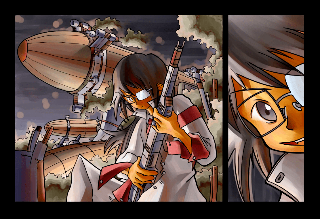
07.10.24: Because 2007 is so damned uneventful, the next most significant thing here is our first paintchat featuring the Aruku Reshivu (before she was even named Aruku Reshivu), and the biscotti ship. J has just provided some flavor text for the biscotti ship, “the fearsome pastry-class vessels have been described by enemy commanders as “very tough””. The figure behind the Reshivu is supposedly the vessel’s figurehead, but this is never really shown in the comic.

07.12.06: And we round off the boring 2007 with comic page 464, and a link to said digital tomfoolery.

08.01.25: So now that I’ve mentioned it already, the first thing in 2008 has obviously got to be the Aria picture of 080125. I already mentioned the patchy business, but this one also has a fairly “loose” lineart first seen in the 071120 Chikara painting. Again, another element that persists in the paintings up through today. I like the colors too in this one; the lights on the spacecraft are a nice touch, imo.

08.04.12: Paintchat of this date is my first painting on the TC4200. For a pure-digital piece, I think this turned out really well; I still can’t figure out how to do this digital from-scratch thing.
08.06.10: After a couple false starts, comic 485 finally gets the shading that I use for the rest of the comic right. There are a couple more experiments as shown in d208, but at this point I really try to focus on consistency so there really aren’t that many milestones on the comic/sketch side after this. Even on the painting side, we really just have incremental adjustments over the last “best piece” dotted with some fails.

08.07.02: And we finish 2008 with the DMG 2008. Not even sure if it’s worth mentioning. Not really different from its direct predecessors; it’s only claim to fame is being “best piece” for a while.

09.03.12: Oh man, this one’s great. Only worth mentioning simply because I never, never do this kind of drawing. It’s a copy, but it’s not that bad, and it turns out I was more flexible than I thought. Way better than the DMG copies of 2003. Thank you ART140 for this picture of president Obama.

09.03.26: I didn’t comment on comic page 525 when I posted it in d261, but this is really supposed to be the climax of the storyline. It’s not totally representative of the comic pages here in back of the story due to the difficulties I had in drawing the last panel, but it does finish off what I consider one of the best art-wise sequences in the comic so far. I mean it’s really gone a long way from piddly stuff we’ve seen earlier in this post. It’s dynamic, consistent, you can tell what’s happening… the only thing that I think has gotten worse – and yes, there are things – is that the newer everything are a lot less ambitious than the old ones, though the execution within the new drawings realm of competence is certainly a lot better.
Like I wouldn’t do things like that punch in 200, panel 6 anymore, nor would I try to do a finished piece with two full characters at the scale of the 050111 DMG piece. Having tried these things and either not liked them or whatever, I just discount doing it these days.

09.07.12: Ok, I think these are the last thing for 2009. This is the new sketching paradigm followed by the new painting paradigm.

09.12.12: Yeesh, ten years is a long time.

Ok, that’s it. That’s officially the longest entry ever, and it’ll most likely remain that way.
