[130103]
Well this post is labelled for 2012 because the painting was supposed to be done last year. It’s labelled “R2” because of this rubbish painting from June.

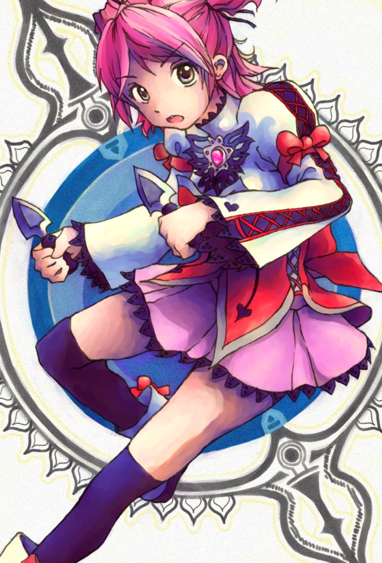
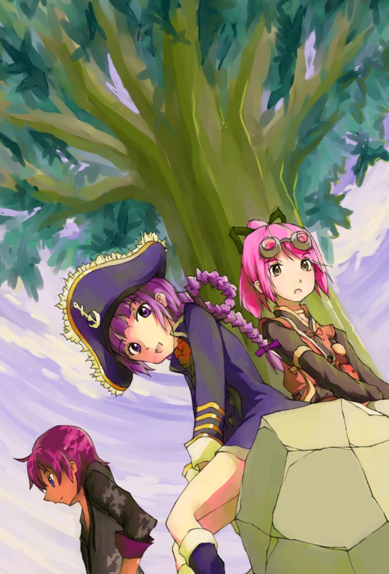
Back in January I told J something like “I’m going to make three paintings that I actually like this year”. Had this actually been completed last year, it would have been the 13th out of 18. In 2011, it was basically 0 out of 5. In fact the total painting count for 2012 (and this is not counting “full” experimental and “sketch” paintings) was just 3 shy of my all-time high of 20 in 2006, which still surprises me considering the long-term trend.
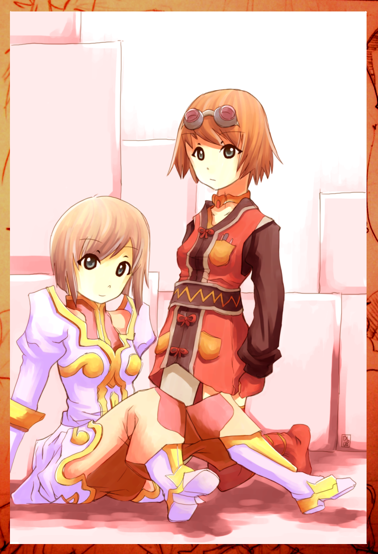
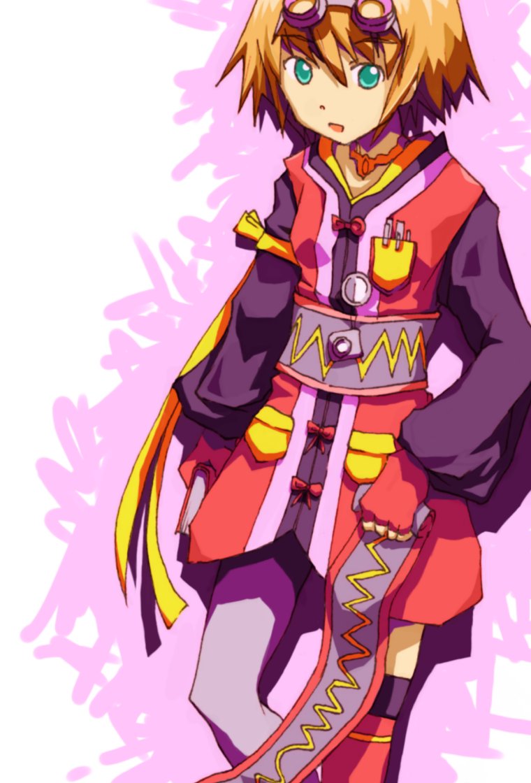
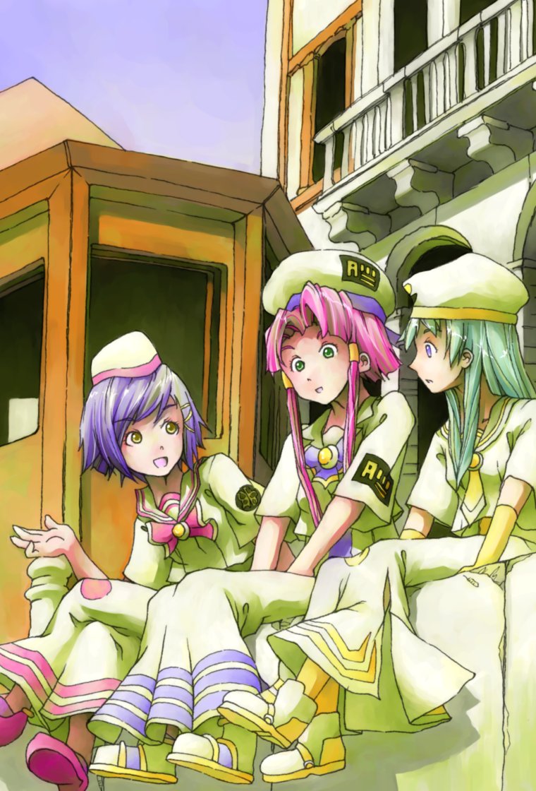
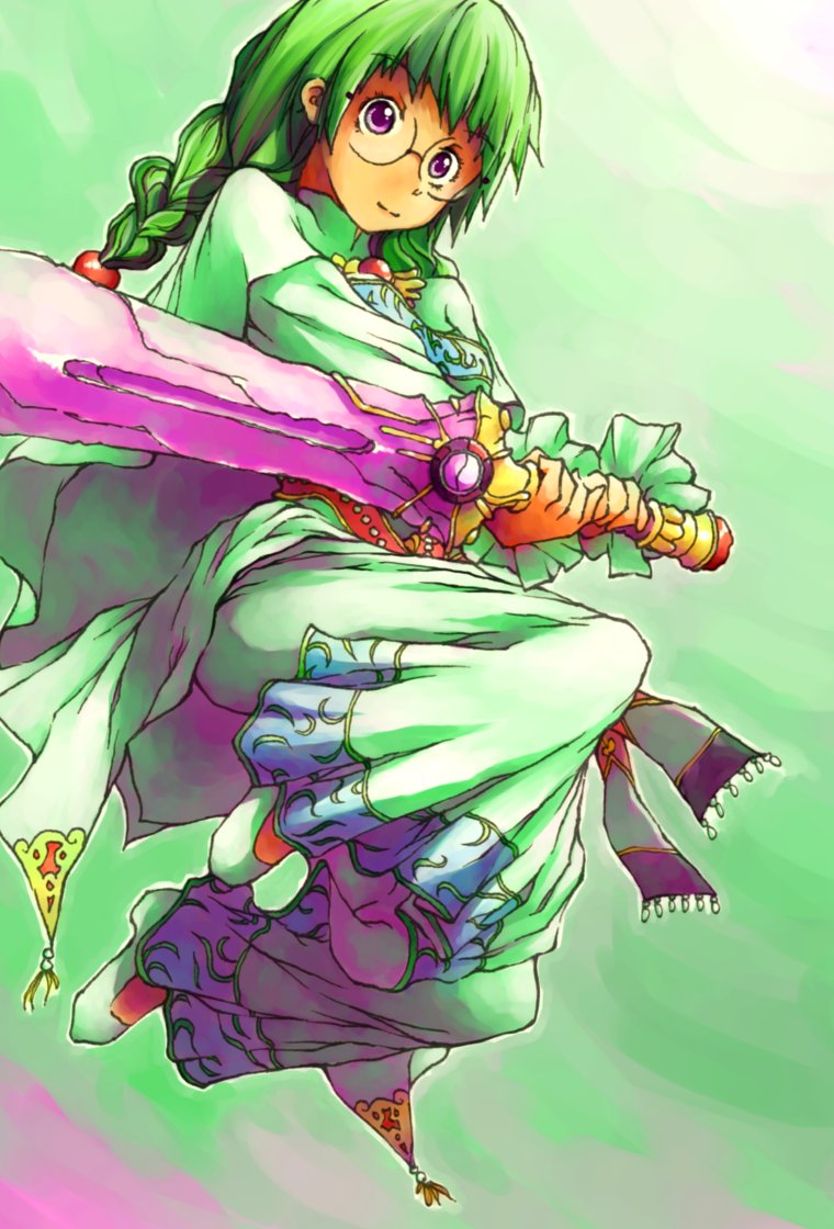
Despite this achievement the biggest deal in drawing for 2012 was actually finally switching to pen. For a while I was thinking that it would never happen, especially given the numerous false starts I mentioned in d356. That being said, it’s been a couple months now, and I think I can safely say this isn’t a false start. For sure ink has solved more problems than it introduced, and some parts of this painting are definitely a product of the switch.
So let me list some of the “features”, which are new to this year:
All-ink lineart with HB backdraw. I’ve actually been surprised at how much better line quality turns out when I’m not tracing the final ink layer. Everything from the Cheria to the Misuzu was a pen “finish” of a conventional HB lineart, and I just feel that the final lines are less refined than those in Graces R2 and this painting. Maybe it’s just me.
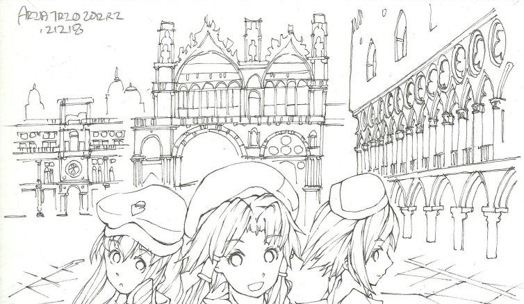
Slightly hybrid “gritty” background. The “slightly hybrid” part refers to the fact that it’s not entirely detailed in pen. A couple small sections are paint-only, as seen in the raw lineart. “gritty” is J’s term, but to me it refers to not trying to be exact about the drawing and just going for the suggestion. It’s like the whole implicit/explicit thing I keep ranting about for painting.
Pen-tool based paint process. I talked about this in d358, and I even had those test paintings, but this is the first time I’m implementing it at scale in a traditional painting (as opposed to a from-reference a la last update). These are not strictly done with the pen tool by any stretch of the imagination, but using it really helps with precision in form and in color.
While I think the figures are actually pretty good, I’m still more happy with the background in this. It’s the first nice, non-abstract painting background that I’ve had for a really long time. Both the pen lineart and pen painting contributed immensely. I think I’m also starting to get a grip on painted clouds, but we’ll see with a few more samples. Copying stuff – or even modifying from reference – really helps in everything as well.
Overall I guess there is still a ton of volatility in painting quality. The rubbish June painting came right after the quite decent Philia painting; it was done basically the same way, so I don’t really understand why I think it’s that bad. I was trying to investigate a little by using the same characters and palette here, but I’m not really sure it helped.

