
In the future, I might look at the content in this post as a turning point. Then again, I might not.
Previously, my relationship with ink has been a downhill journey at best. When I first started doodling in preschool or elementary school, I used all sorts of permanent drawing tools including pens and markers and crayons and whatnot. Back then I don’t think my drawing sense had any concept of “rightness”, so I don’t think there was ever anything “wrong”, and as such, there was never any need to erase. As late as the first adventures of BKS this still appeared to be the case.
That being said, that first comic was probably one of the last of its kind, and ink doesn’t show up again until 2002, when I did a series of pen and colored pencil “paintings”. The pen was, of course, only used to trace the original lineart such that the colored pencil didn’t smear anything. A little later, I made an attempt to implement ink in my normal drawing process, but that clearly didn’t pan out.
It was only much, much later in 2010, that I finally turned out some decent drawings in pen, albeit for a class. I even attempted to ink a figure in pen, but ultimately, I went back to pencil for another two years. Ink came back in 2012, but it was, yet again, a matter of tracing completed pencil… until now.
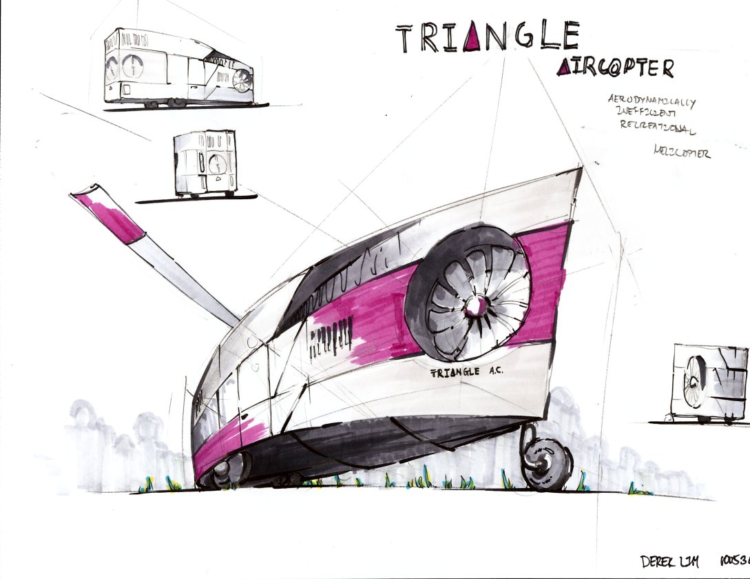
This chapter actually starts in June, when I asked J for a topic to draw. He suggested “neoclassical”, and I sat on it for a while. I had something in mind, and I made a thumbnail or two, but for whatever reason, I didn’t get started in earnest until just a few days ago. For whatever reason, and I’m not really sure if this was premeditated, I started in pencil and decided to throw some pen in there, not as a trace, but as the original lines. Ultimately what resulted from J’s suggestion is this monstrosity:

And that is what I believe to be the turning point.
For the longest time, I had considered ink a handicap; my pen ability was something I had to improve in order to bring it on par with my pencil ability. I was very focused about the fact that you can’t erase ink, and not focused on anything else. I’m not really sure why my perspective began to change while doing this drawing, but within the past few days, I’ve reversed my stance on pen; it’s definitely an enabler as opposed to a disabler.
I’ve been using an 0.1 Copic Multiliner for all of the drawings in this post. I think what got me hooked at the very beginning in the neoclassical mess was that, even with this pen, which is by no means my “sharpest”, I could draw much finer lines much more consistently than I ever could with pencil, mechanical or not. The thickness of your line becomes a function solely of how hard you press, rather than a function of the rotation of your mechanical pencil and the angle of the “face” of your lead.
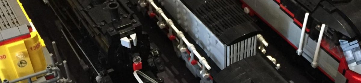
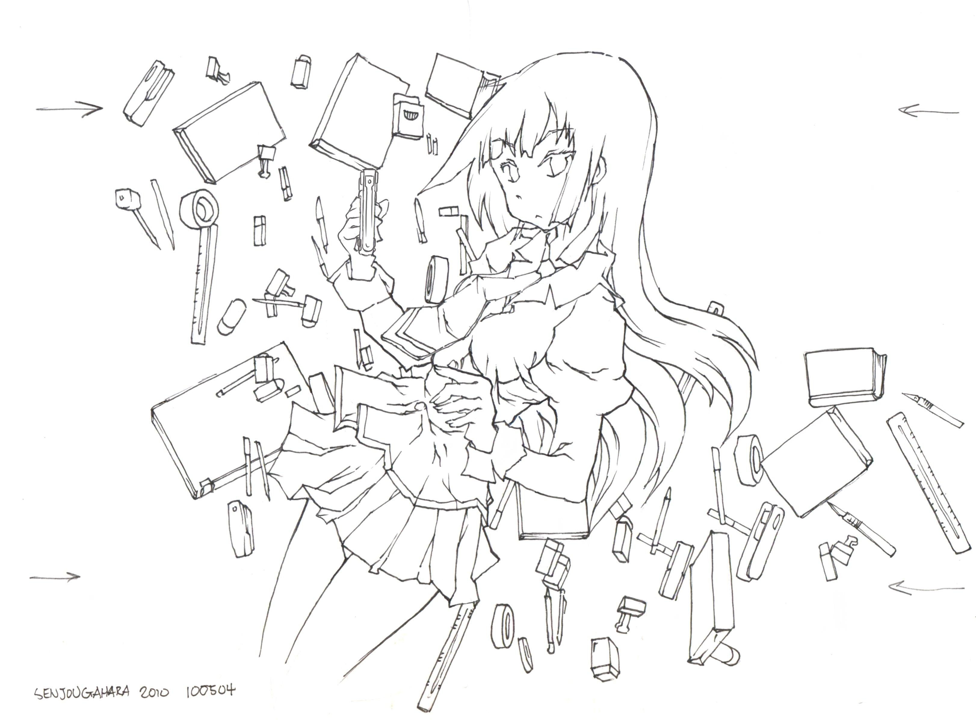
About halfway through the neoclassical station, I thought things were going pretty well, and and I thought that I should try a figure:

I started with my usual 6H/HB process, using a 6H pencil for the back draw and an HB pencil for the “final” lineart, and slowly added pen into the mix, eventually realizing that I could ditch the 6H back draw altogether.

And this is the crux of the matter: the fact that you can’t erase is a blessing rather than a curse. I moved my 6H/HB process to HB/pen, using the HB mechanical for back draw and ink for the “final” lineart. The HB back draw can be so much more accurate and detailed than the 6H back draw could have ever been, such that the need to erase is suddenly very diminished, and practical nonexistent at the pen level. Furthermore, if the back draw becomes too messy, I can “lock” good lines with ink and erase the back draw, something that was never possible with the 6H/HB process since both 6H and HB erase equally well.
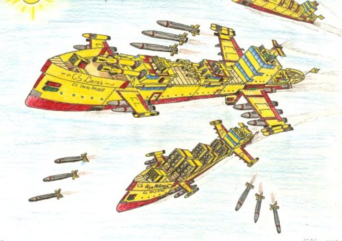
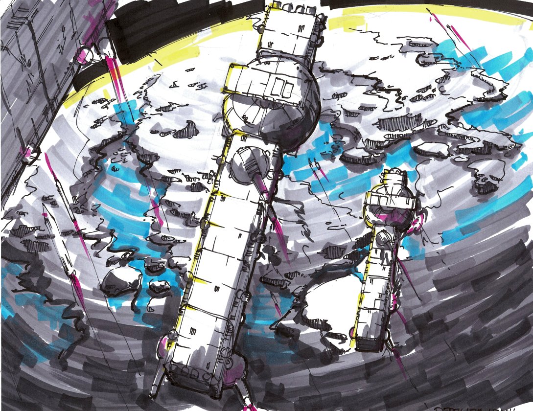
I think the floodgates to something may have opened with this new process:

This is another one of J’s topics, “drydock”. I honestly don’t think something like this would have been possible until now because the 6H back draw would have been dense enough in many places such that I couldn’t tell what was happening and such that I couldn’t image-process it away without image-processing away “good” parts of the drawing as well. Furthermore, something with this much junk would have previously taken up a full page, but this is packed into half a page; the line density is absolutely stunning. It’s like a Retina display.
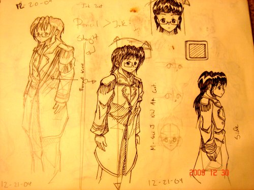
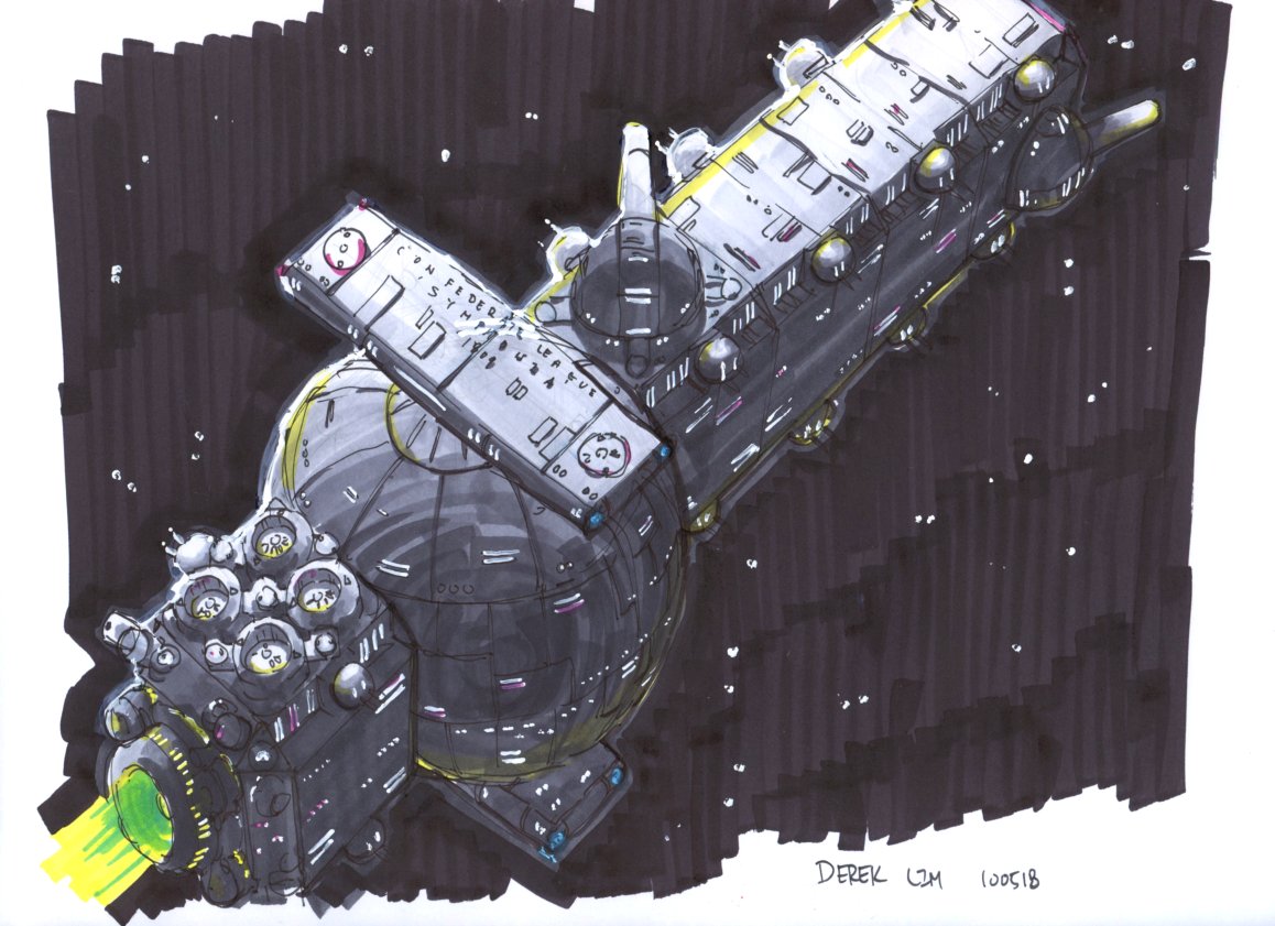
I have one more photo, and it’s a comparison of line density:

On the left is a drawing from what might now be the last era with which I was pretty happy. On the right is the neoclassical station shown above. A photo is a better comparison here due to re-sizing and whatnot. I think there is close to a twofold increase in line density, and the contrast between final lines and back draw is also much higher with the new process, especially with a light erasing.
But that’s all for now. I think that between some overly complicated back draws and my while deal about doing better foregrounds and backgrounds I may have been unknowingly looking for this “solution” for a long time now. I suppose, as usual, we’ll see how it goes…
